video_library Media
Easy to use to adapt your image and videos on many ways
Images
Images can be styled in different ways using Materialize.
Responsive Images
To make images resize responsively to page width, you can add the class responsive-img to your image tag. It will now have a max-width: 100% and height:auto.
<img class="responsive-img" src="cool_pic.jpg">
Circular images
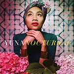
This is a square image. Add the "circle" class to it to make it appear circular.
To make images appear circular, simply add class="circle" to them
<div class="col s12 m8 offset-m2 l6 offset-l3">
	<div class="card-panel grey lighten-5 z-depth-1">
		<div class="row valign-wrapper">
			<div class="col s2">
				<img src="img/yuna.jpg" alt="" class="circle responsive-img"> <!-- notice the "circle" class -->
			</div>
			<div class="col s10">
				<span class="black-text">
        			This is a square image. Add the "circle" class to it to make it appear circular.
				</span>
			</div>
		</div>
	</div>
</div>
Videos
We provide a container for Embedded Videos that resizes them responsively.
Responsive Embeds
To make your embeds responsive, merely wrap them with a containing div which has the class video-container
<div class="video-container">
	<iframe width="853" height="480" src="//www.youtube.com/embed/Q8TXgCzxEnw?rel=0" frameborder="0" allowfullscreen></iframe>
</div>
Responsive Videos
To make your HTML5 Videos responsive just add the class responsive-video to the video tag.
<video class="responsive-video" controls>
	<source src="movie.mp4" type="video/mp4">
</video>